
In this blog article, we will discuss the most common mistakes in product photography and provide direction about how to avoid them and create stunning professional pictures for your online business.
Common mistakes: Camera Settings
Nothing will deter sales and attract complaints worse than an inaccurate product photo. Customers want to know exactly what they will be receiving when they purchase your product. An inaccurate product image will mislead prospective customers and lead to item returns or worse: bad reviews.
To ensure that your photos are accurate with respect to color, lightness, etc., we recommend:
- Shooting in manual mode (M) with auto focus,
- Correctly setting your white balance according to your light source, and
- Convert your images to SRGB.
1. Manual mode
Using manual mode (M) will allow you to truly take advantage of your camera’s advanced capabilities and properly expose your image to include your product’s highlights. You can learn more details on how to take advantage of your camera settings reading our DIY 2 blog post.
Don’t confuse manual mode with your camera’s focus mode, you can set your camera to manual mode, which means that you control all of the settings, but still set your lens to auto focus.
The first thing to do is focus on your product to get a “light reading” through your camera’s viewfinder. Your exposure indicator line may move depending on how much light is needed. Adjust your shutter and f/stop according to your meter reading through camera.
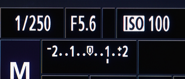
Image caption: The dotted line with the numbers in the middle is the light meter. Ideally, the line that is currently beneath the 1 would be at the 0 for optimal exposure.
Note: If you are using mono strobe lighting, you may need to use an off-camera light meter to help with this.
Bright lighting should be one of your biggest concerns as an online apparel retailer.
Too light
Perfect
Too dark
2. White Balance
White balance is a setting that will keep your colors accurate. It is sometimes referred to as “color temperature.” Photographs with a yellowish or reddish tint are said to be “warm,” while a bluish tint is “cool.” White balance does just that it balances the tint to produce accurate colors. Accurate white balance will help your product to appear as close to what your eye and camera see without requiring many post-production adjustments.
Proper white balance is determined by the type of light source. Natural sunlight and standard light bulbs have warmer color temperatures, while fluorescent and LED light bulbs tend to be “cooler.” In Auto White Balance mode, your camera can automatically detect the type of light source you’re using, but you can also adjust your settings manually.
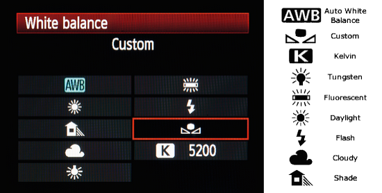
Image caption: The white balance symbols vary between the camera brands, so you’ll need to learn your camera’s symbols well.
This should help eliminate any differences you may see on screen and with the product. By trusting your camera’s capabilities, you and your customer will both be satisfied because your images will deliver trustworthy results. As you can see below, we are using a lighting kit with its flash mode on. The best image with the best color overall would be the flash setting. When worse comes to worse, try the auto white balance setting because the camera will compensate for you!
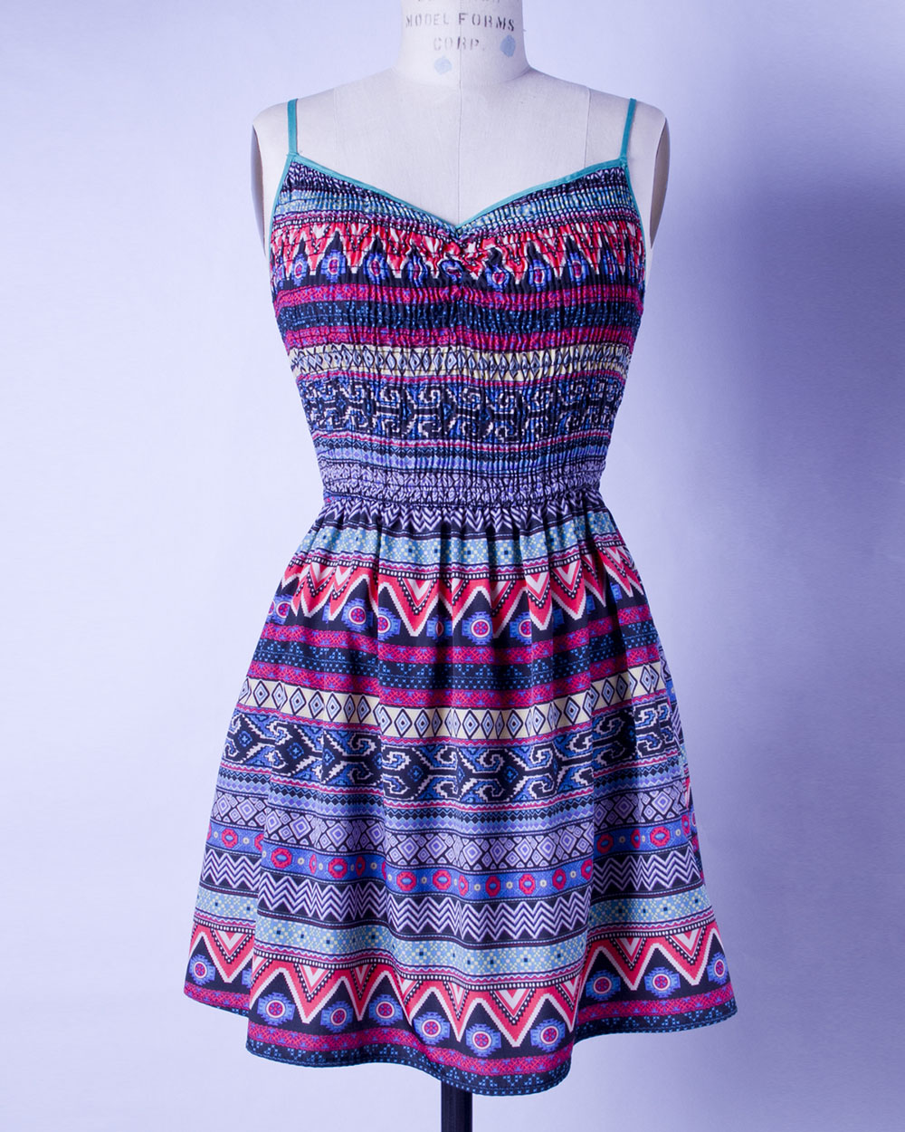
Fluorescent
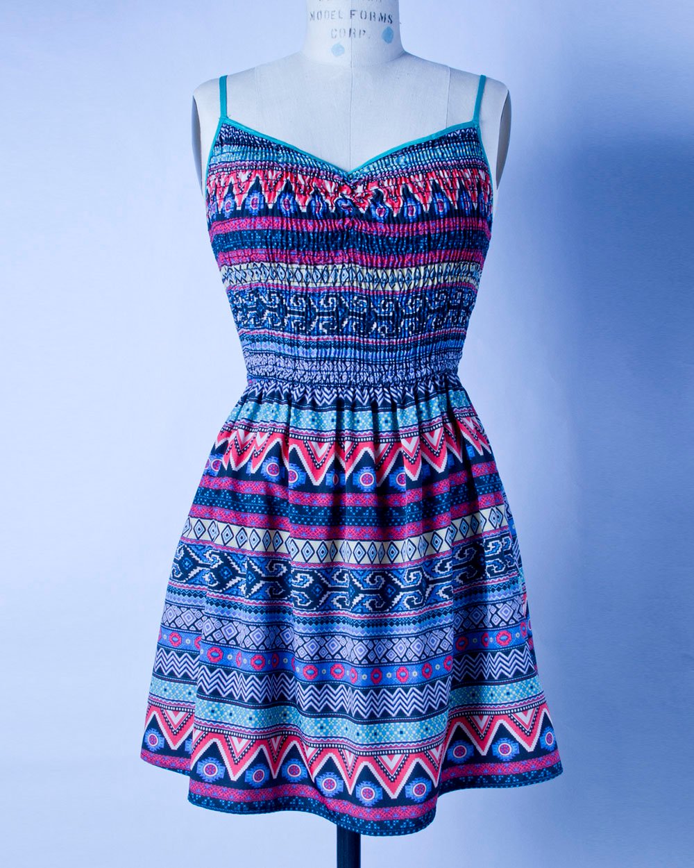
Tungsten

Cloudy
Flash
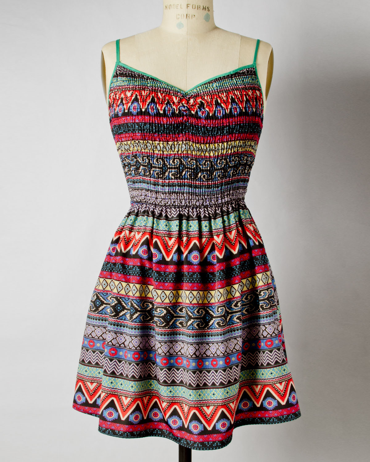
Don’t use multiple light sources
Try not to use multiple light sources, like natural outdoor light with a lamp light bulb. The mixture of different light sources will cause the overall light to be different throughout. The example on the left shows bad lighting when using natural sunlight and lamp light. You can see the left side of the dress is a warmer tone and the right side is a cooler tone. Using one light source will help make the entire product look the same.
3. SRGB
Another possible reason that the colors in an online image of your product might look different to those of the actual physical product has to do with color profiles. Every computer screen has a different color profile, which means that every screen interprets colors a little bit differently. To someone using a Mac to view your product photo that you edited and uploaded on your PC, your product may seem oddly yellow or dark.
The same is true for web browsers. Sure, the product image might look accurate to you in Google Chrome, but it may look totally different when viewed in Firefox or Safari. To fix this problem and make sure that your product images are as accurate as possible, you’ll need to change your .jpeg files to the SRGB color profile.
Understanding how to use your camera’s manual shooting mode and white balance setting, and understanding how to convert images to the SRGB color profile should eliminate any differences you may see between your product and images taken of your product. Your customers will be satisfied because your images will deliver trustworthy results.
Common Mistakes: Image Composition
1. Too Much Change
When change occurs too often in your images, the lack of consistency can confuse your customer and discredit your products. Keep your images simple, clean and, most importantly, consistent to ensure a great customer experience. Try using a timeless white or grey background that will remain appropriate year-round and across multiple online channels.
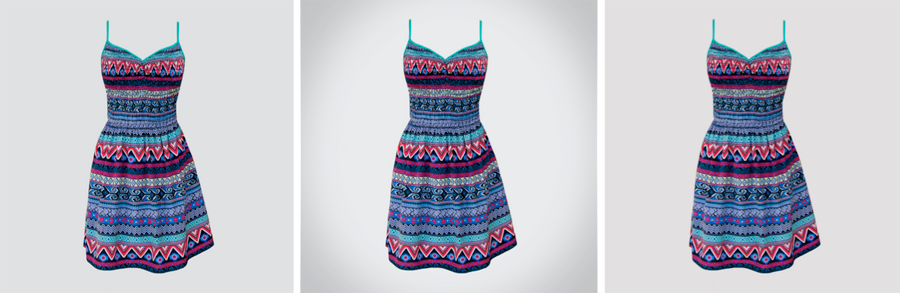
Image caption: All three of these images are appropriate ways to handle apparel image backgrounds. Just be consistent with the style that you choose!
2. Busy Backgrounds
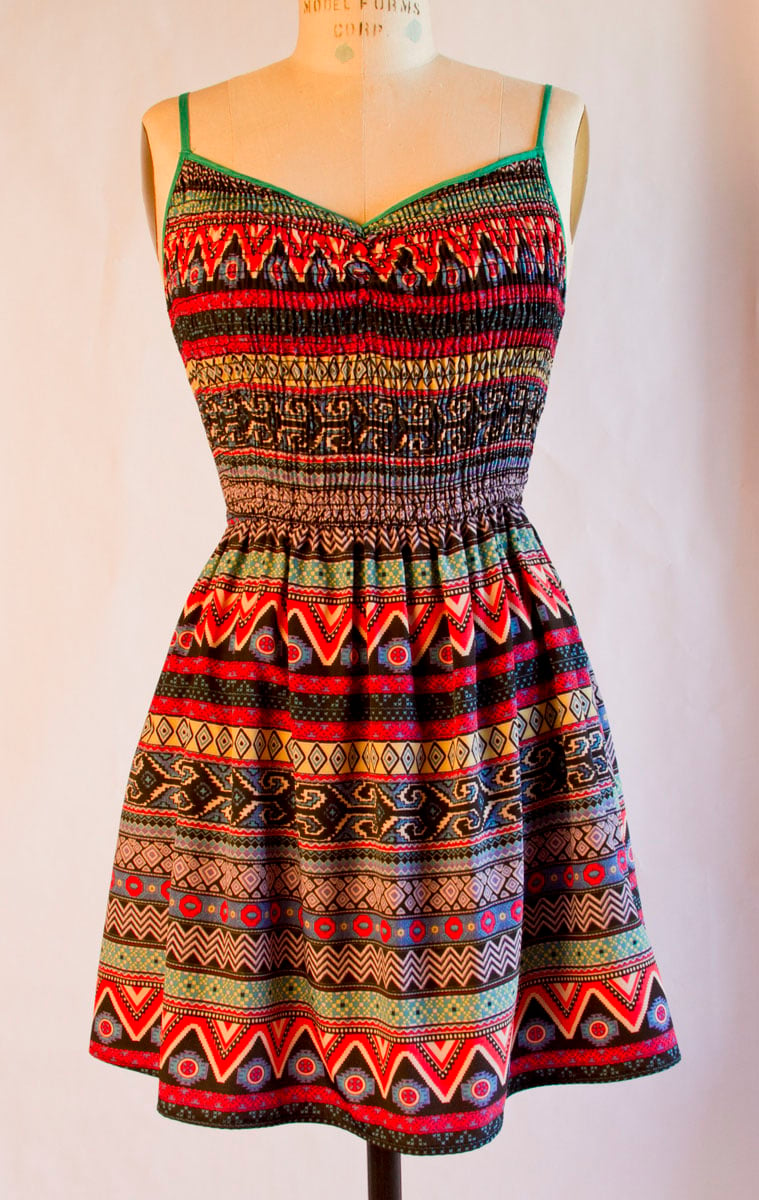
Keep everything in the image simple and clean so that your product stands out. Additional objects, patterns, and light sources can distract the customer from the product that is actually being presented and make the image appear rushed. It’s best to photograph the product alone on a neutral background, as shown above, and to avoid shots like the ones below.

Image caption: The busy backgrounds, mixed light sources, and apparel display stands distract from the product in these images.
The most common light source types are tungsten, fluorescent, LED, and natural sunlight.
3. Blurry Focus
Sharpness and clarity is appealing to the human brain, so you want to use that to your advantage in your product photos by making sure to get everything in focus and to minimize camera shake using a tripod.
Another important consideration here is F-stop, or “Aperture.” Generally, the higher the aperture (F/2.8, F/5.6, F/11), the sharper the details in your image will be. Most lenses provide great sharpness between F/5.6 and F/16, but you’ll need to test your specific lens to determine the optimal F-stop for your product photos.
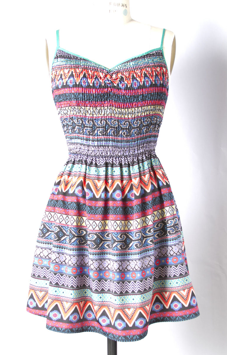
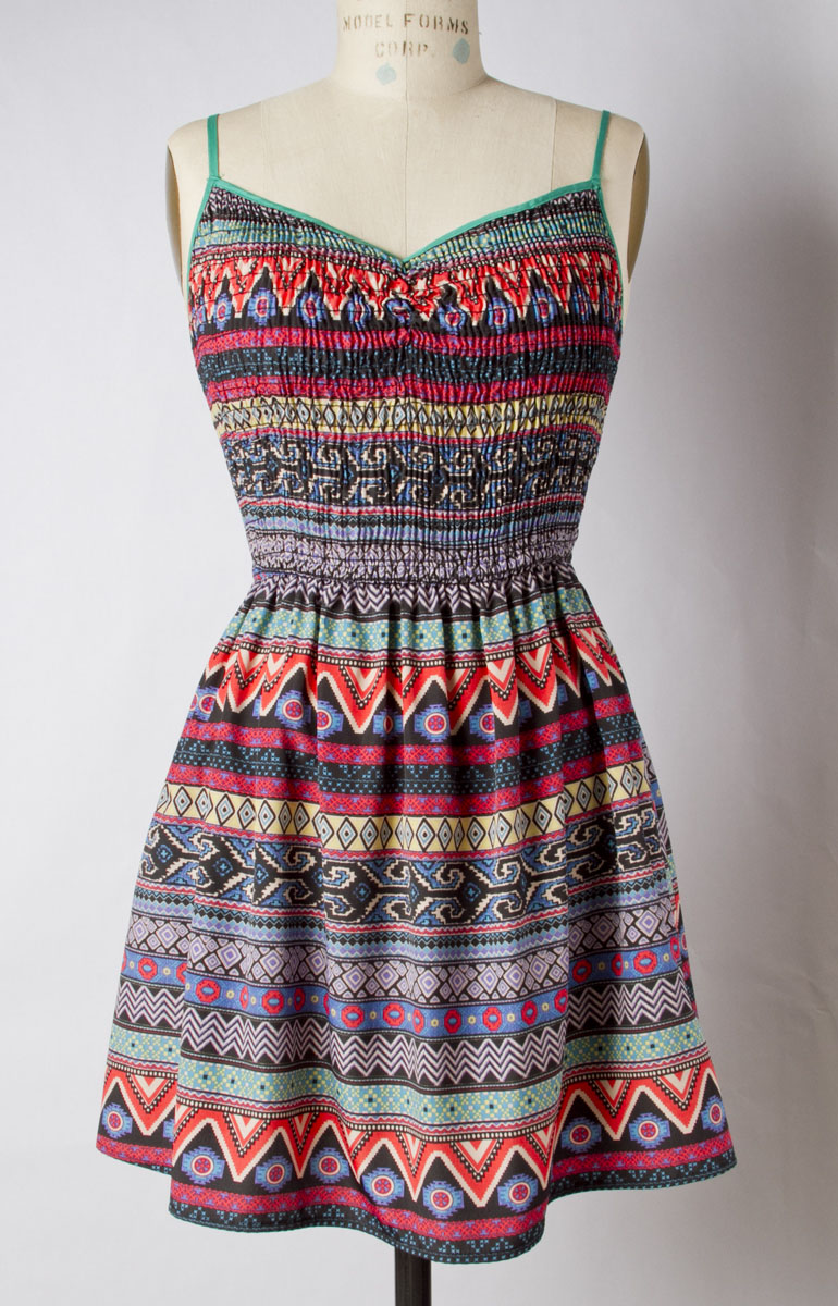
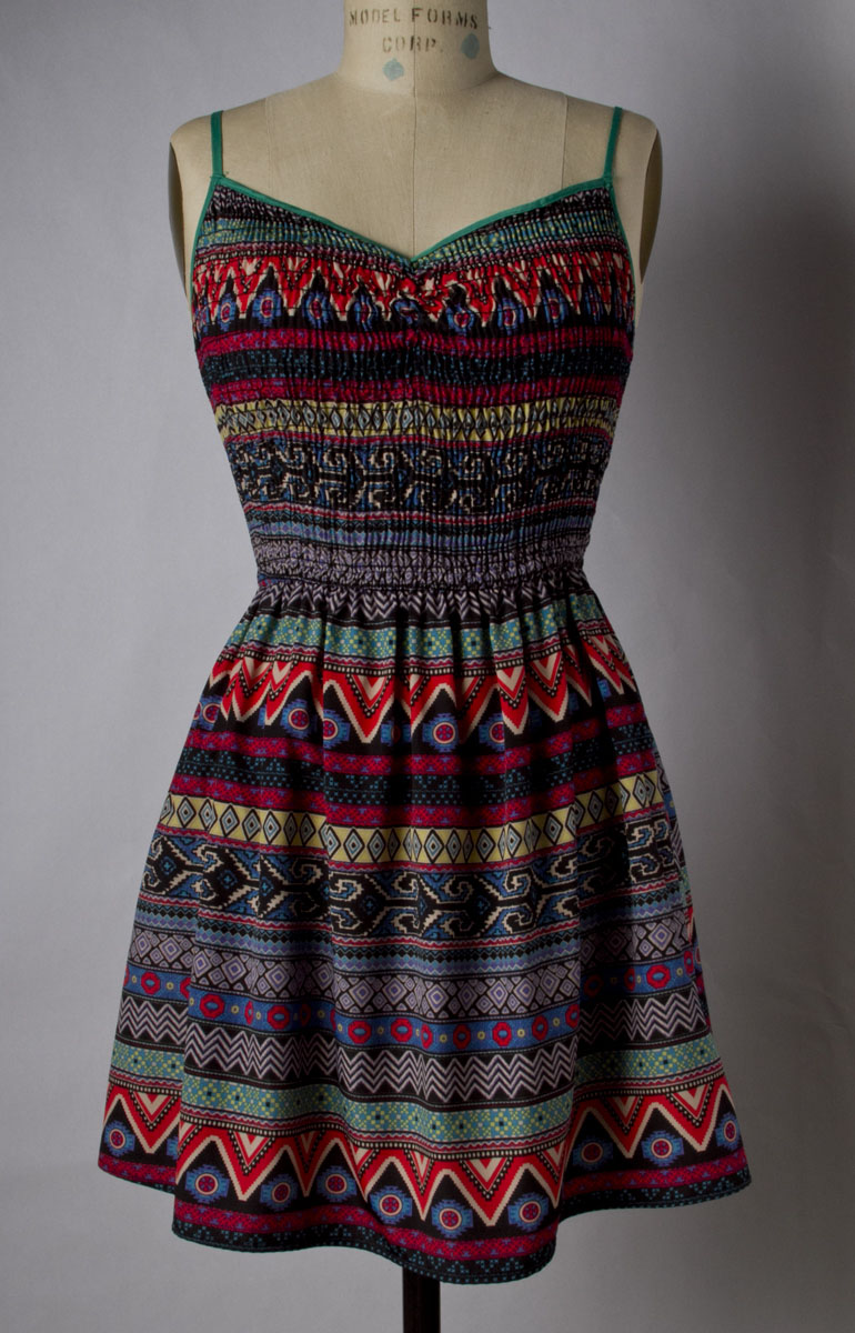
Out of Focus
In Focus
4. Compulsive Cropping
Notice that the focal length and crop for each of the images remain the same. This is another important aspect to consistency in product photography. Showing multiple images varying in size and direction, for example horizontal/vertical and large/small, can be very confusing. You would do well to avoid multiple crops and sizes so that your presentation of your product appears consistent and seamless to your customer.
Horizontal crop
Square crop
Vertical crop
Many online channels require certain web standards, so follow their Marketplace Image Guidelines to help make your product look its best. You can create a template using those guidelines in your editing software; this can help boost the consistency of your product images and speed up your workflow.
Create a template using the guidelines. This can help align your product and should keep your process fast and efficient going forward.
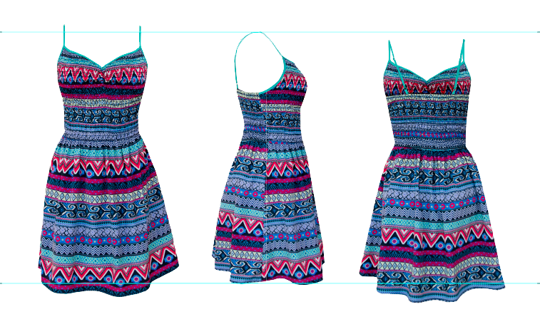
Image caption: These images are not aligned neither show the correct sizing across.
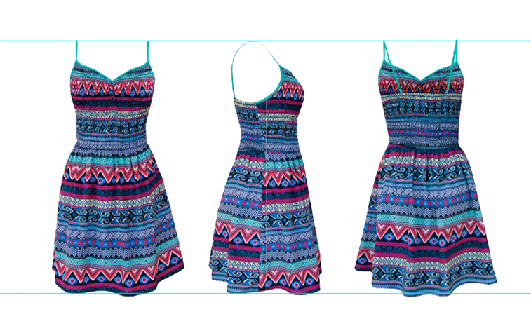
Image caption: Consistent and clean product view, with the correct aligning and sizing across.
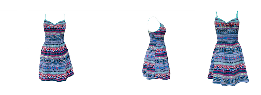
5. No Variety
The number of images and the variety of angles that you show your customers will affect your sales. Quality, detailed shots can help the customer see fabrics, patterns and other important product details that will influence your customer’s decision to purchase or pass over your product.
To avoid this common mistake, capture as many angles of your product as possible, but make sure to keep the focal length the same to maintain that consistent, clean look.
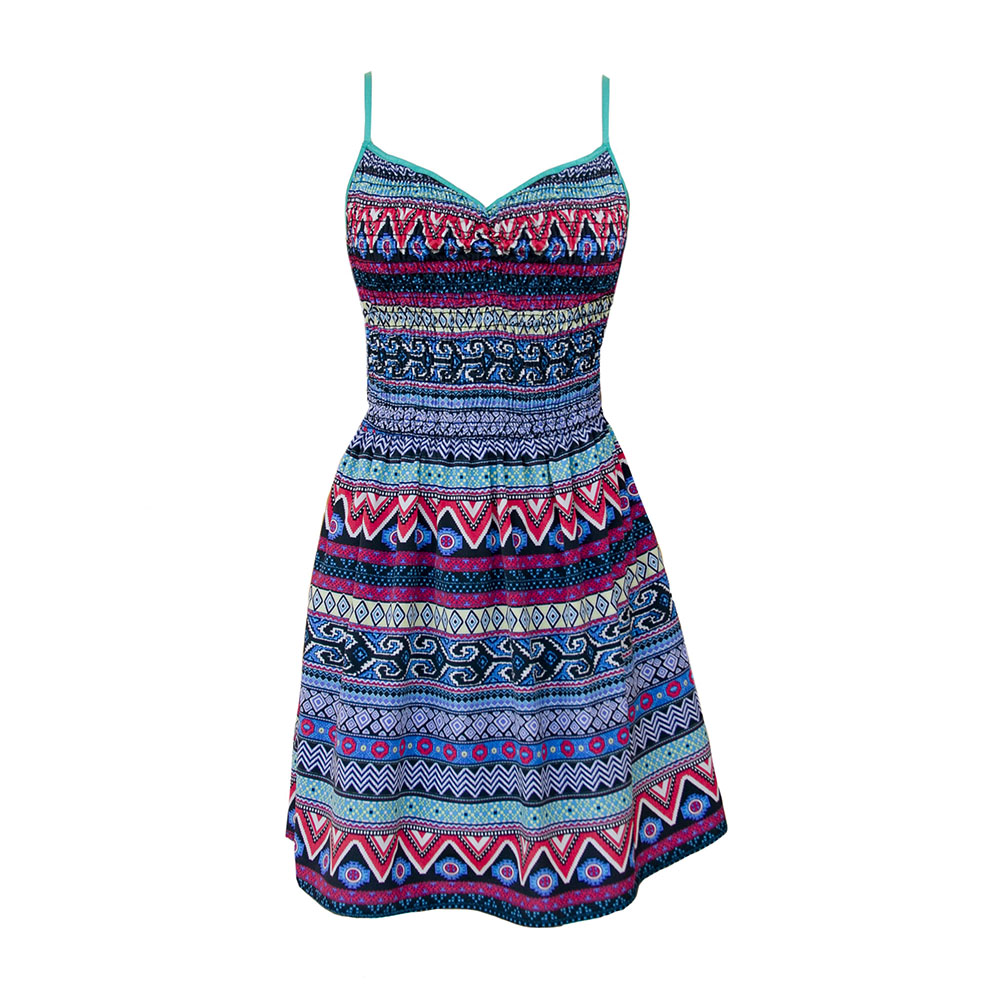
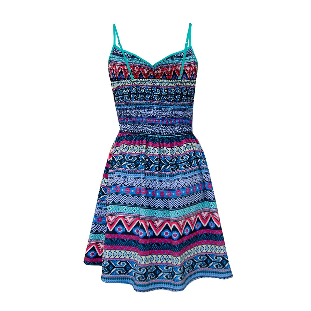
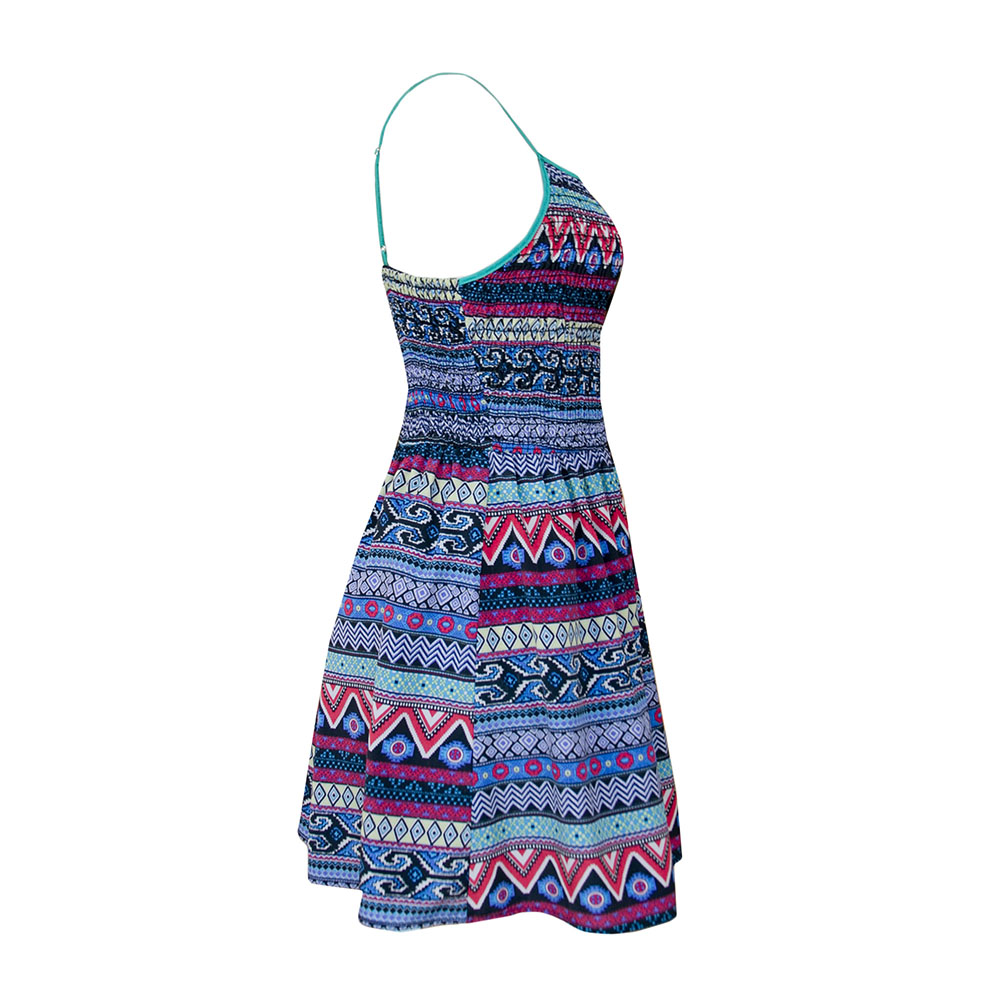
Image caption: Providing multiple angles of view gives the customer as much information as possible about your product.
If you avoid these simple and easy-to-miss mistakes, the quality and value of your photos will help enhance your customer’s overall experience.