
1. Sloppy Preparation
While most, if not all, imperfections and extraneous details can be removed from your product in post production, that type of advanced editing is time-consuming and requires a fair amount of technical skill. Instead, remember to remove all tags, strings, and stickers from your product before you photograph it.
Next, you’ll want to examine your product and repair any imperfections that you find; sometimes jewelry comes in missing stones or gems, and it can be a bummer not to notice those hand-fixable details until you pull up the image in Photoshop, because cloning isn’t as easy as it looks, and re-shooting requires time that could be spent elsewhere. After repairing damages, it’s time to give the product a thorough cleaning and dusting. Even the smallest speck of dust will be visible to viewers if you execute the photographs with the correct amount of sharpness, and in jewelry product photography, the shinier a product is, the better!
2. Inconsistency
Inconsistency is never a good thing, even when it comes to jewelry images. When your images change too often in relation to your other product photos, the lack of consistency confuses and distracts customers, and lowers the professional appearance of your website and business. Instead of cropping and sizing each photo differently or varying other settings, such as lighting or background colors, you should create a “template” of guidelines to ensure that each image is taken and edited the same way.
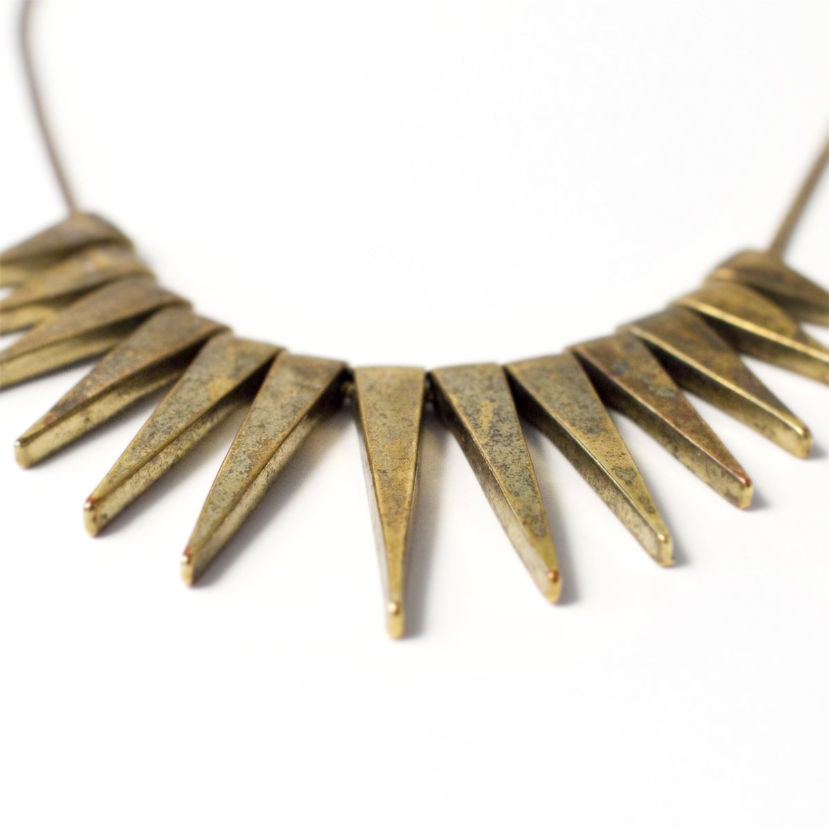
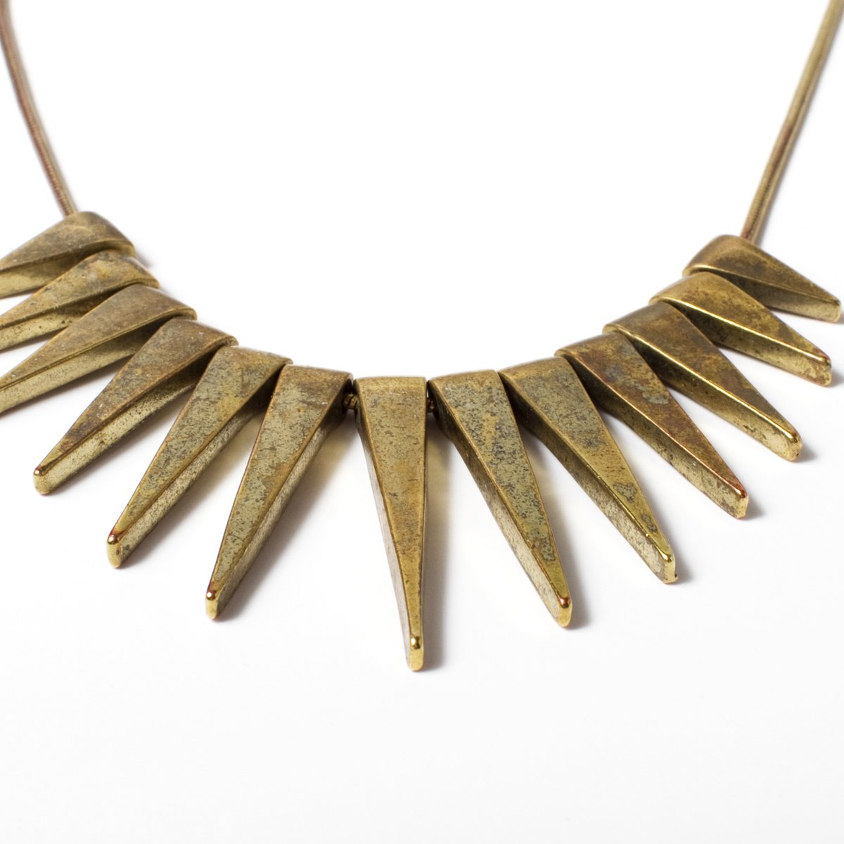
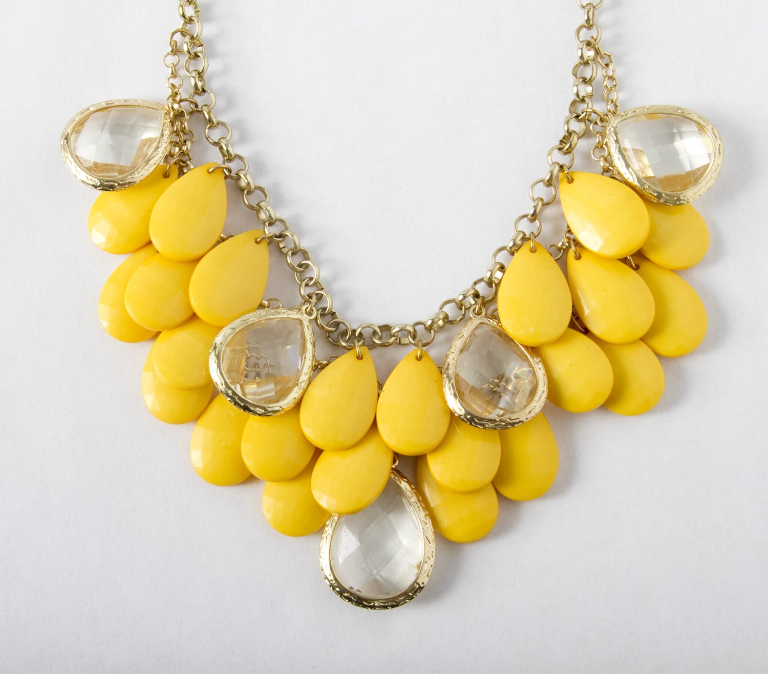
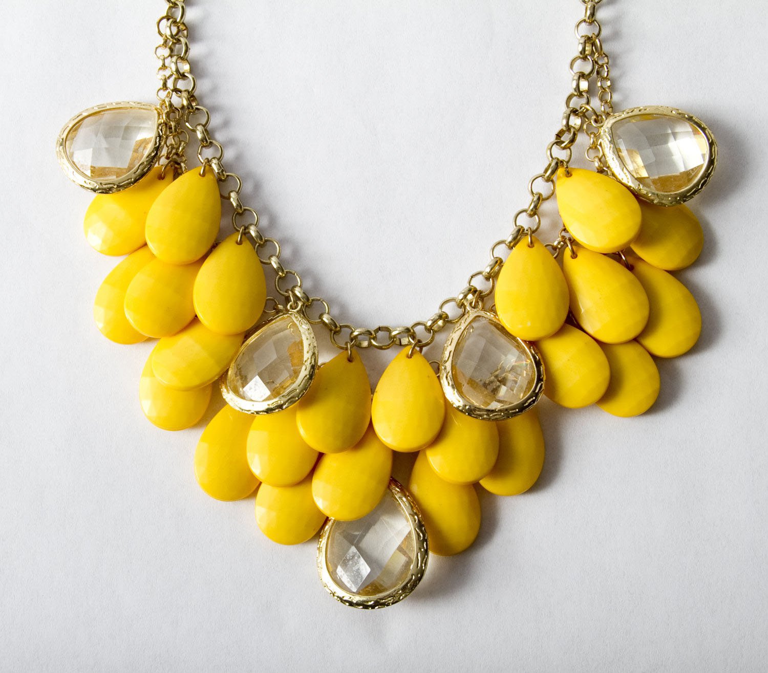
Examples of inconsistent cropping/sizing
For example: you don’t have to use a white background, although that’s what we recommend. What you need to do is choose one “style” for your jewelry photos and stick with it!
3. Busy Backgrounds
The best way to keep your images simple and clean in order to provide your customers with a seamless shopping experience, is to photograph your products against a white background. Light background colors like white and grey will give your jewelry a “timeless” feel, and avoid possible distractions that might be brought on by a patterned backdrop. As mentioned earlier, you’ll need to pick a style and use only that style throughout your product images.

All three of these product image styles are appropriately clean and uncluttered. Choose one and go with it.
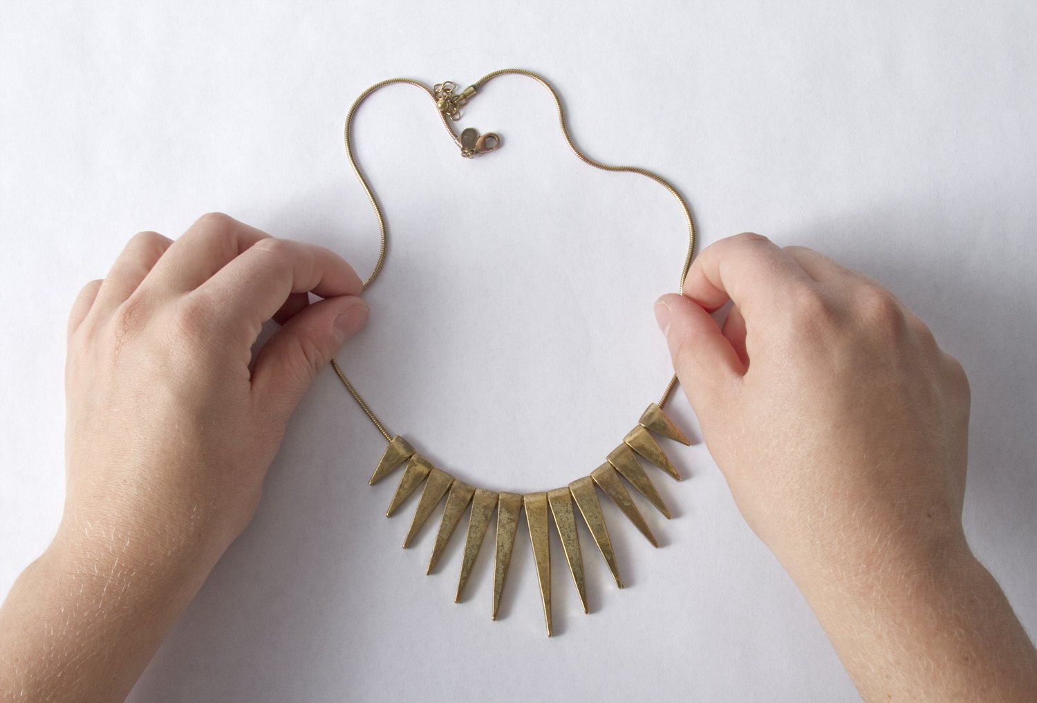
4. Unnecessary Props
Good news! You won’t need to worry about locating props or mannequins or live models for your jewelry photography, because props tend only to distract from the product and spoil the “clean” and professional look you should be going for in your product photos. In fact, it’s actually best not to hang the jewelry from anything at all, but rather to lay it flat on the white backdrop.
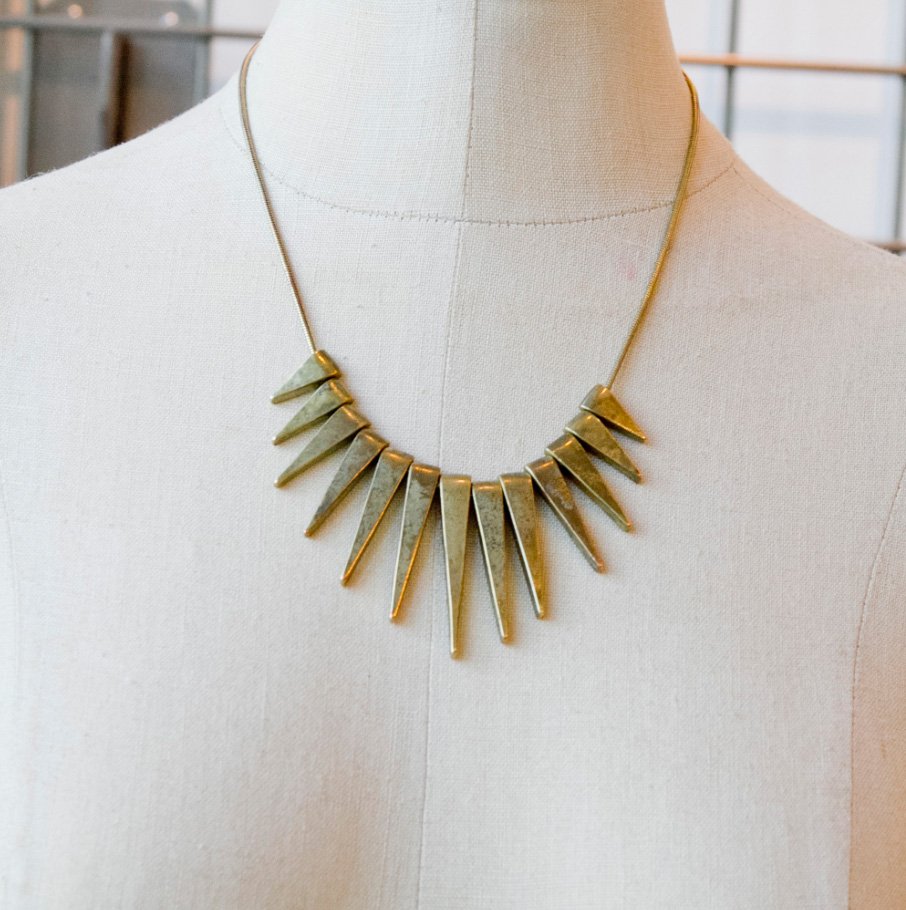
Keep everything in the frame simple and clean so that your jewelry really shines. Here the mannequin is only a distraction, because it impedes the viewers ability to see the entire necklace.
Light background colors like white and grey give jewelry a timeless feel and prevents distractions.
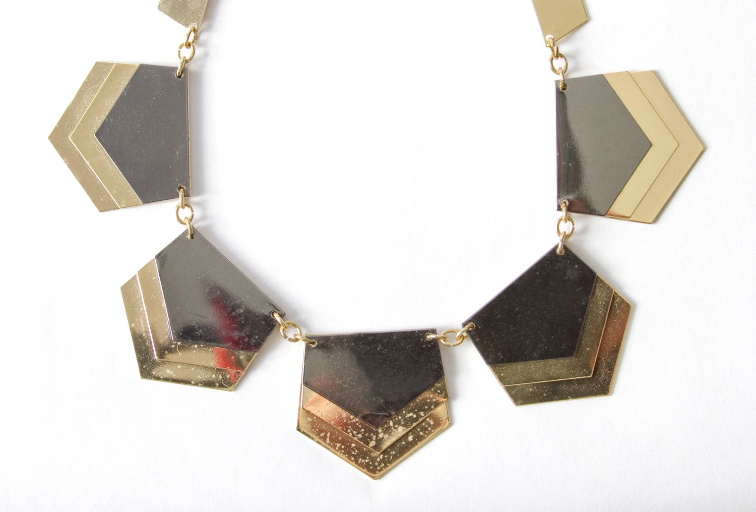
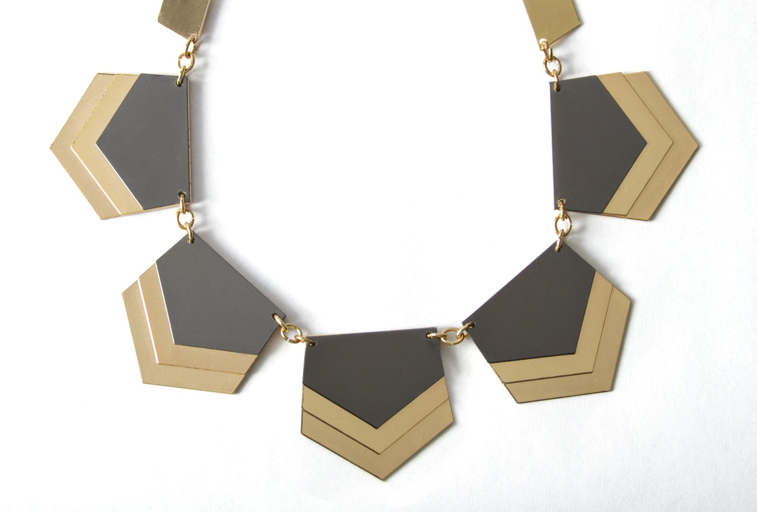
5. Inaccurate white balance


These two images have neither clean backgrounds nor appropriate white balance.
Believe it or not, the two images above depict the same exact necklace, but in different lighting situations. The metal in the image on the left appears golden yellow, while the metal in the image on the right appears to be a gradient of colors with blue as the defining color. Had the photographer chosen the proper white balance settings for each individual image, the colors would have been the same in both frames. You can set the white balance manually, but we recommend simply setting your camera to “automatic” white balance mode; this will allow your camera to recognize the type of light source (natural sunlight, light bulb, flash, etc.) and capture colors as close to how they actually appear in real life as possible.
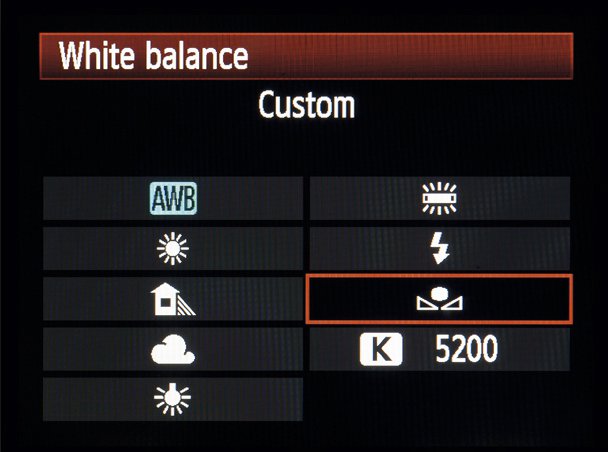
The white balance menu in your camera usually looks something like this.
6. Reflections
Reflections
No reflections
Let’s face it—jewelry is shiny, and while sparkle is great, camera lens reflections and white highlight spots visible on your jewelry is not. Take great care not to create these distractions on your jewelry while photographing them. If you’re having trouble with reflections, try changing the jewelry’s position, or yours, in relation to the light source. You’ll probably need to zoom in to closely examine the product to ensure that you haven’t captured any reflections.
7. Soft focus
Keep everything in focus by shooting with an aperture of f/11 or greater. In order to really capture your customers’ affections, your jewelry product images need to be as sharp and crisp as possible. The more “fall-off” or soft focus you have, the less the customer will be able to see your product, as shown in the two images below.
Low aperture (f/1.8, f/2, etc.)
High aperture (f/9, f/11, etc.)
As you can see, the left image has a short depth of field and the focus “falls off” fairly fast, the further the product is to the camera. The image on the right keeps all of the product in relatively sharp focus, even the areas that are farthest away from the camera. Soft focus can be artsy, but in jewelry photography, it tends to backfire because the human eye values sharpness above all.
Create a “template” of guidelines to ensure that each image is taken and edited the same way.
8. Contrasty Light
Soft light
Harsh light
Harsh lighting is a big mistake in jewelry product photography. Direct, “contrasty” light is notorious for exposing imperfections in products, adding unbecoming shadows, creating unavoidable reflections, and other nuisances that may or may not be able to be fixed in post. Instead of dealing with harsh lighting, photograph your jewelry in soft, natural sunlight streaming in from a window or in soft, artificial studio lighting. As an added lighting sidenote, we recommend that you learn your camera’s manual mode, so that you are able to control how much or how little light your camera pulls in to make your pictures. Read our DIY 2 post about how you can take advantage of your camera settings shooting in manual mode.
9. Wishy-washy cropping and sizing
Remember when we mentioned consistency? It’s very important that you crop and size all of your jewelry product images in the same way. Multiple crops and sizes (not to be confused with multiple angles, which are awesome) will only confuse customers and lessen the professional “look” of your website and offerings. Develop a template to help you crop and size with accuracy. Many online channels require certain web standards, so follow our post about Marketplace image guidelines to help make your jewelry look it’s best.
Try changing jewelry’s position, or yours, in relation to the light source if reflections appear.
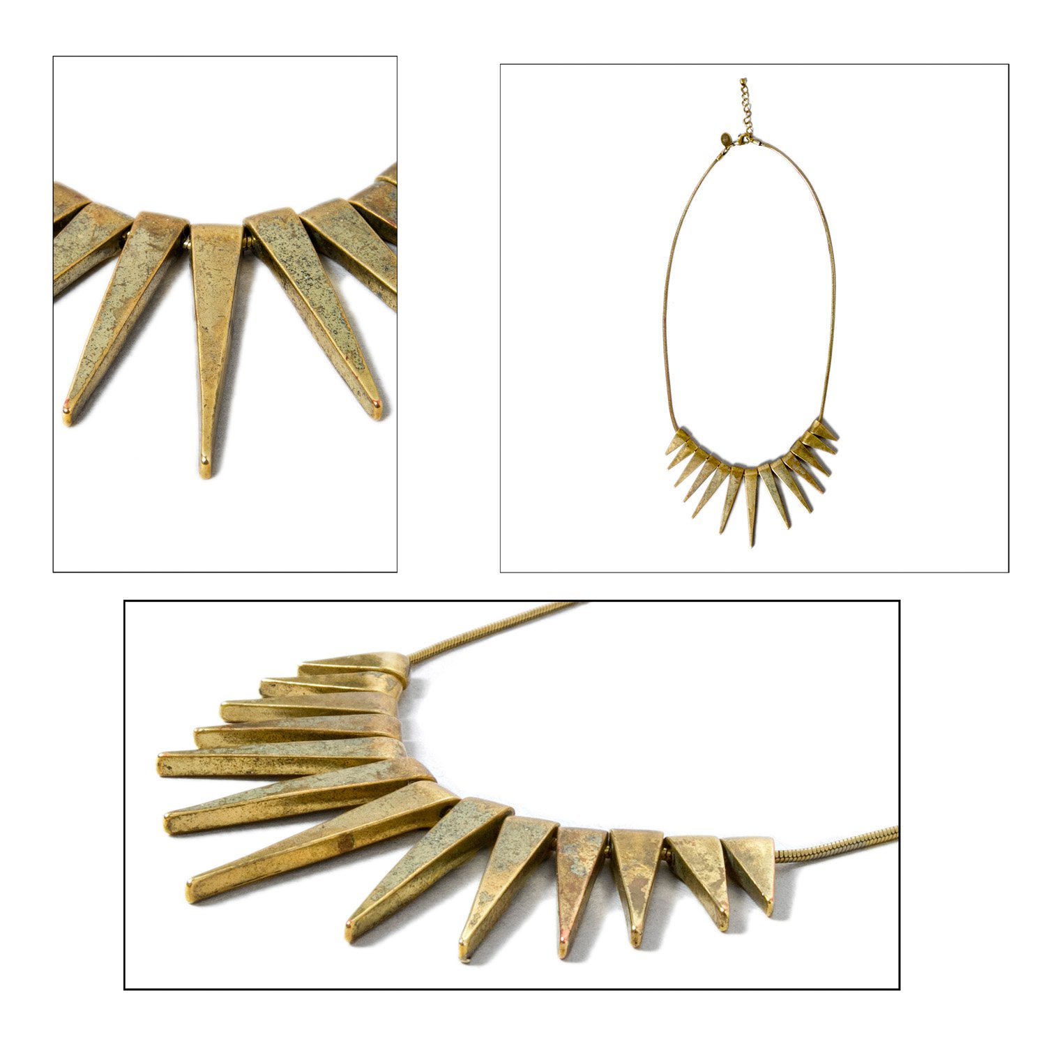
10. Few angles
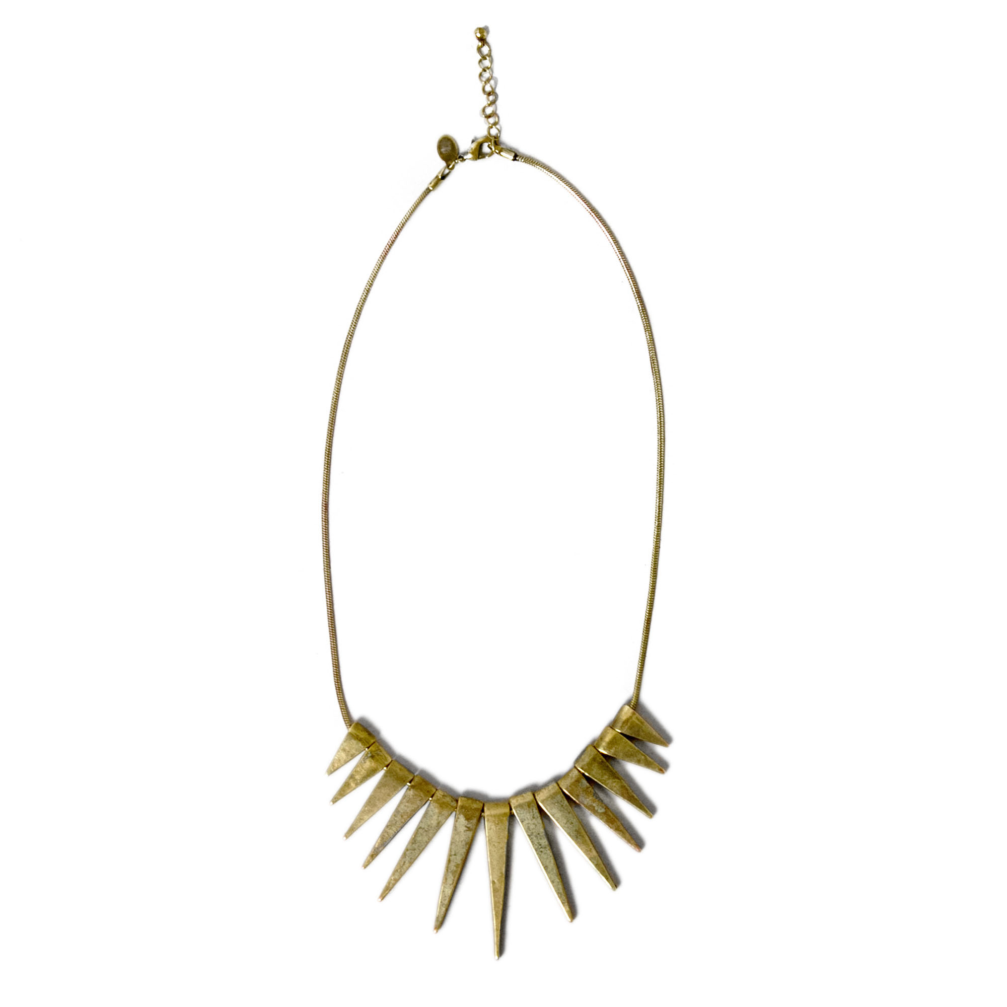
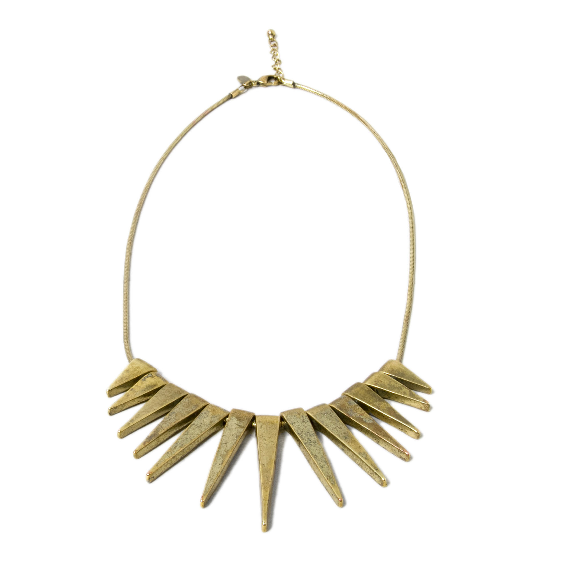

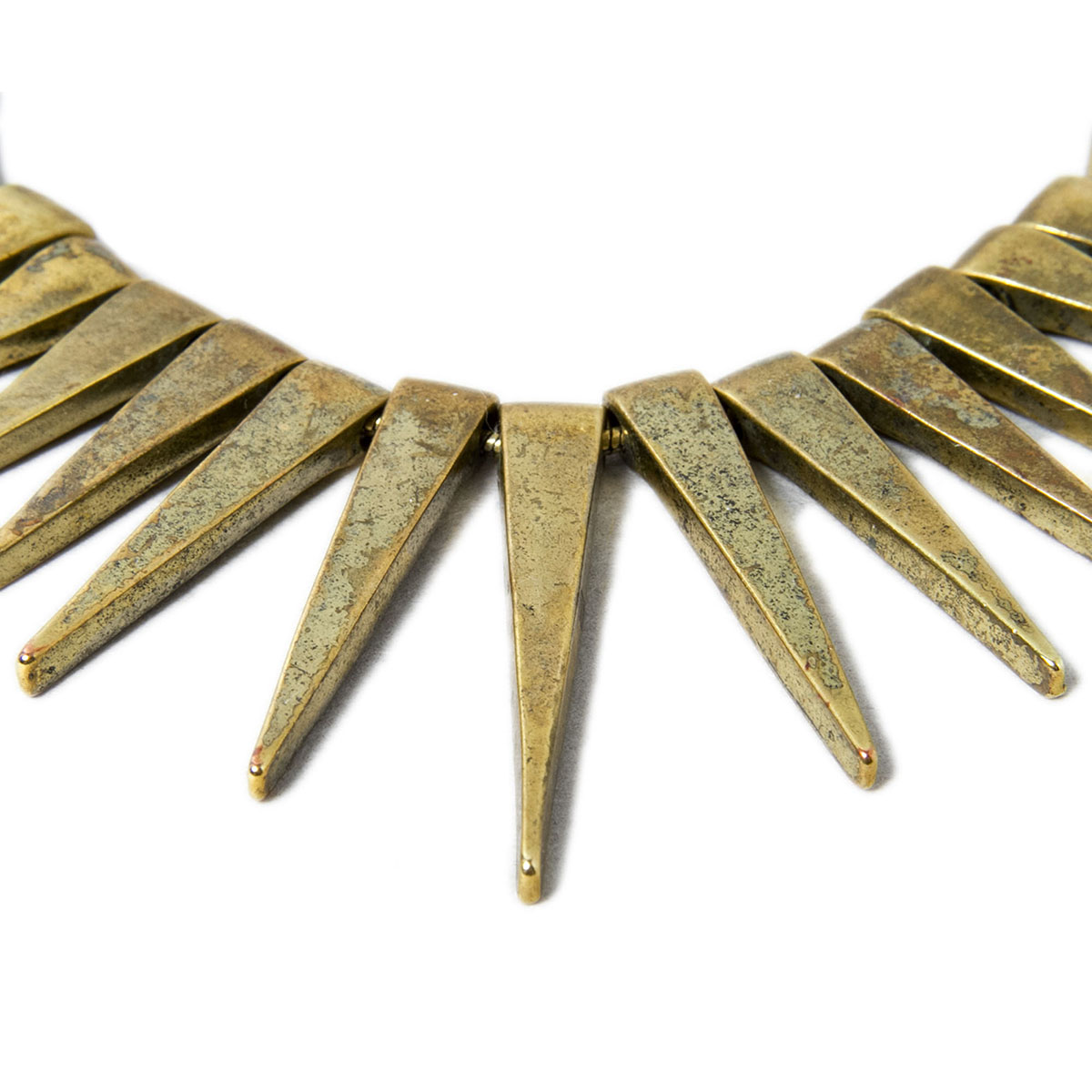
These are all excellent, flattering angles!
As we’ve said before, your customers want and need to be able to see your product from all angles, as if they’re examining it and turning it over in their hands, while standing in a physical storefront. The more angles and images you create to promote your product, the better. We recommend shooting at least a straight-on image from the front, an angled image from the front, a close-up detail shot and a top view, as shown above. There are plenty of other angles that you could photograph—just remember to stay consistent! Embracing these principles in jewelry product photography, can really help boost the professional “look” of your website and hopefully, boost your product sales! We also expect that you start getting some great customer feedback about how your excellent photos, improved their shopping experiences.