
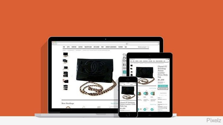
Example of an unoptimized and unresponsive eCommerce page.
Browsing on a website that’s not optimized for mobile is a poor experience, especially when shopping. If you left after only a few seconds, you’re not alone. Design firm Copter Labs reports a 28% higher bounce rate for mobile visitors than non-mobile visitors when a website was only designed for desktops.
Example of an optimized and responsive eCommerce page.
There’s a solution for optimizing websites for mobile: responsive design. A responsive website checks the device of a visitor and reacts to it by changing shape, text size, and image size. It gives all your visitors the same content, but adapted to their screen in a friendly and easy to navigate manner.
Every eTailer should have a responsive website. Here are two compelling reasons:
1. Mobile has overtaken desktop. We’ve passed the tipping point.
Look at this August, 2014 announcement from popular ecommerce platform Shopify: “Last week represented the first time in history that more people used mobile phones and tablets to visit online stores than using computers. Looking at data from over 100,000 ecommerce stores that use the Shopify platform, we saw 50.3% of traffic coming from mobile (40.3% from mobile phones, 10% from tablets) and just 49.7% from computers.”

Big brands believe.
In a March, 2015 earnings call, Nike announced they had more mobile traffic than desktop traffic. An analyst noted, “Nike.com sales were up 42 per cent in the three months to February, propelled by increased traffic and conversions from mobile visitors outmuscling desktop browsers for the first time.”
2. Google rewards responsive websites.
Improve your rank.
All the way back in 2012, Google directly stated they prefer responsive websites. Using responsive design, instead of a desktop-only site or serving a different mobile site, will improve your search engine ranking. Google recognizes the sharing benefits of responsive sites across devices, so they rank responsive sites higher.
Do you list your products with Google Shopping? Learn how to optimize your Google Shopping product images.
What does this mean for product images on responsive websites?
First, let’s look at what happens by default. When you’re using responsive web design, the same site is served to desktop and mobile users – it’s just rearranged. The dimensions of your images will be adjusted to fit the screen, but they’ll still be the same images – the same content, resolution, and (crucially) file size. A high-resolution 20 MB image of a dress may be valuable on a desktop, where a user can zoom in and see detail while maintaining perspective, but it’s overkill for mobile and will result in slow loading over cellular data.
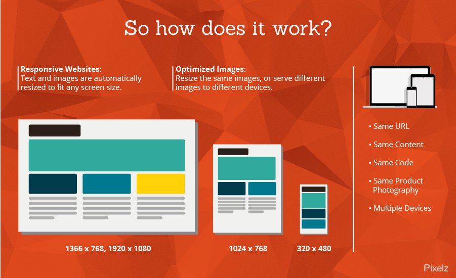
What you really want is to serve visitors the highest quality image they can appreciate – but no higher.
There’s a few methods for doing this. We’ll look closer at two methods, along with effective free solutions you can use.
1. Resizing Images with Adaptive Images
One simple solution is Adaptive Images. Adaptive Images is a small PHP script that detects the visitor’s screen size and resizes your images to deliver the proper size for the device. You don’t have to create images yourself for the vast array of different screen sizes and resolutions in today’s mobile market; it does everything on the fly. It can even handle high resolution Apple Retina displays. It’s completely backwards compatible, meaning that if you add the script today it will handle all of your existing images. If you’re worried about cost, don’t be: it’s free!
The setup is quick and easy if you’re comfortable managing your website’s files at your web host. If you’re used to working with your website, it can literally be completed in 5 minutes. If you’re using WordPress, there’s a similar plugin you can use called ImageMagick.
Those are the good things about resizing images with Adaptive Images. What are the negatives?
First, if you use a Content Delivery Network, Adaptive Images doesn’t work with CDNs. This isn’t a problem for most small businesses, but may affect large retailers. Second, uploading a PHP script and other files during installation can be intimidating for those who haven’t done so before. Third, sometimes resizing images for each user through a script can slow down your site’s loading speed. Finally, you may want to take a more active approach than just resizing your image.
2. Serving Different Images with Picturefill
If you’re a hands-on person, Picturefill can be effective as a mobile product image solution for your responsive website. Sometimes when an image is made smaller, the art direction is lost. You may want to serve a cropped version, a different shape, or a different image altogether. There are new HTML web standards that let you specify a small, medium, large, and extra large image to use depending on the visitor’s screen size. Not every browser supports the new standards, so Picturefill takes over to guarantee it works.
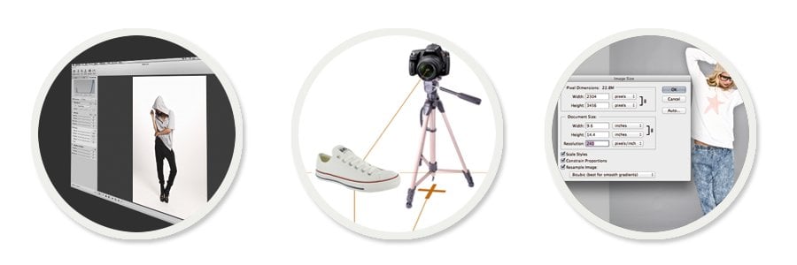
Learn how to develop an efficient photo production workflow, so that you can create Actions in your post-production software that will output images in each size.
Picturefill allows a high level of customization, but it also takes some work to implement. You will need to create alternative images for all product images you wish to handle responsively, and the HTML markup for your site will need editing. The coding is a job for a web developer, which can be expensive (Picturefill itself is free).
You may be able to handle the image resizing yourself, but it can save you time and hassle to outsource it for a convenient 24 hour turnaround. Pixelz lets you specify the image sizes you want, and use our convenient Quality Inspector to review image size and other details in one click before downloading.
The emergence of smartphones and tablets has changed how people experience the internet. With change comes opportunity; the chance to reach more customers, more often, and in more ways. Seize the moment! Optimize your product images for mobile and use responsive web design to ensure you are part of the new internet. Pixelz will edit your product images and deliver them in 24 hours or less.
Start capturing new customers today!